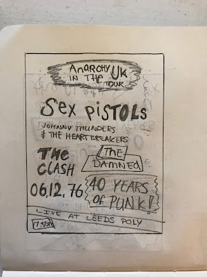
My overall idea for the poster is to create a design that celebrates the both 40 years of punk in the UK as well as celebrating the infamous show that the Sex Pistols did in Leeds back in 1976. I used my research to look at a lot of art work from the punk era including the original posters that were made for the event when it actually happened. I thought the best way to get an idea of how the poster was going to look was by gathering the information that the poster would need.
Poster Information -
- 06/12/76
- Anarchy In The UK Tour
- Sex Pistols
- Johnny Thunders & The Heartbreakers
- The Damned
- The Clash
- Live at Leeds Poly
- 7.30 PM
- Celebrating 40 Years of Punk!
Each poster has this information on it, so that it feels like the posters from when they did play. Each design is going to use different methods that were used during the punk era, as I want the poster to look as if it was from then. I plan to make make all of the textures using cut outs etc and then I will be scanning them in to achieve the punk look.
Idea 01 -
This poster has been inspired by the original posters that were made, I have included use of collage, ransom note style type, and cut and paste methods. I wanted to make the main focus of the design about Leeds and celebrating the date of when the Sex Pistols first played in Leeds, the style is also very traditional and I believe this style of design would be very difficult to re produce digitally.
With this idea I have tired to incorporate a different style that maybe wouldn't have been seen with the very large numbers. This has been done to highlight the key date, the rest of the design uses the bands logos to link in with the infamous night. Ransom note type has been used to give it the punk aesthetic, the irregular placement of the type also has been done to add to the punk style.
Idea 03 -
A more central and less chaotic design to showcase the bands names as these are the main part of the event, I thought it would be important to show off the bands that most people now know along side the more celebratory of the design which has been made bigger to help show what the idea being the poster is.
Idea 04 -
I took inspiration from some of Jamie Reid's work as I felt that this needed to be incorporated within a design as he is the reasoning for the whole punk design movement. The random placement of the ransom type alongside the safety pins and bull dog clips helps to show this. The design would be completely central however I do like the irregularity of the design itself as punk is very random and it doesn't really have any rules.
Idea 05 -
A lot of the punk posters that I looked at where very random and don't follow any rules, so i thought it would just be interesting to just design the first thing that came to my head. i looked at how the space could be filled around the heading and then by adding the outline I made sure the rest of the information was inside it using a selection of different punk styles.
Idea 06 -
Taking the more central idea again, I have made the most important features the biggest (location, Sex Pistols and 40 years of punk) I decided to leave out the date as I felt the "40 years of punk" would be enough to show what the poster is celebrating.
Feedback -
The feedback that I received highlighted what was good about my designs and what was not so good. Nearly everyone said that they thought a couple of the designs were too similar to the original posters which was fine but they thought it would be more interesting to see a design that was new and I should use the fact that I can digitally design parts of the poster to an advantage.
The highlights from the feedback suggested that I take forward the designs that are showcasing the date and the place the best as this is what is important to the brief, which I agree this should be the most important part of the design. Another suggestion was that I should look at using more images/collage as this would be very relevant as I am planning to screen print the design once it is finished I feel halftone images may work very well with the style of poster that I am trying to achieve. Now that I am moving forward to take these designs into a more digital state I will be able to develop these ideas further using the feedback that I have received.


No comments:
Post a Comment